Client
GolfNow
Role
Lead Designer, Research Assistant, Prototyper
Year
2024
Problem
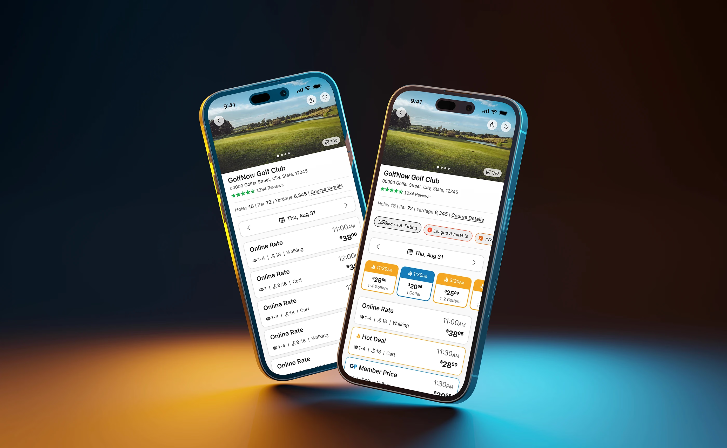
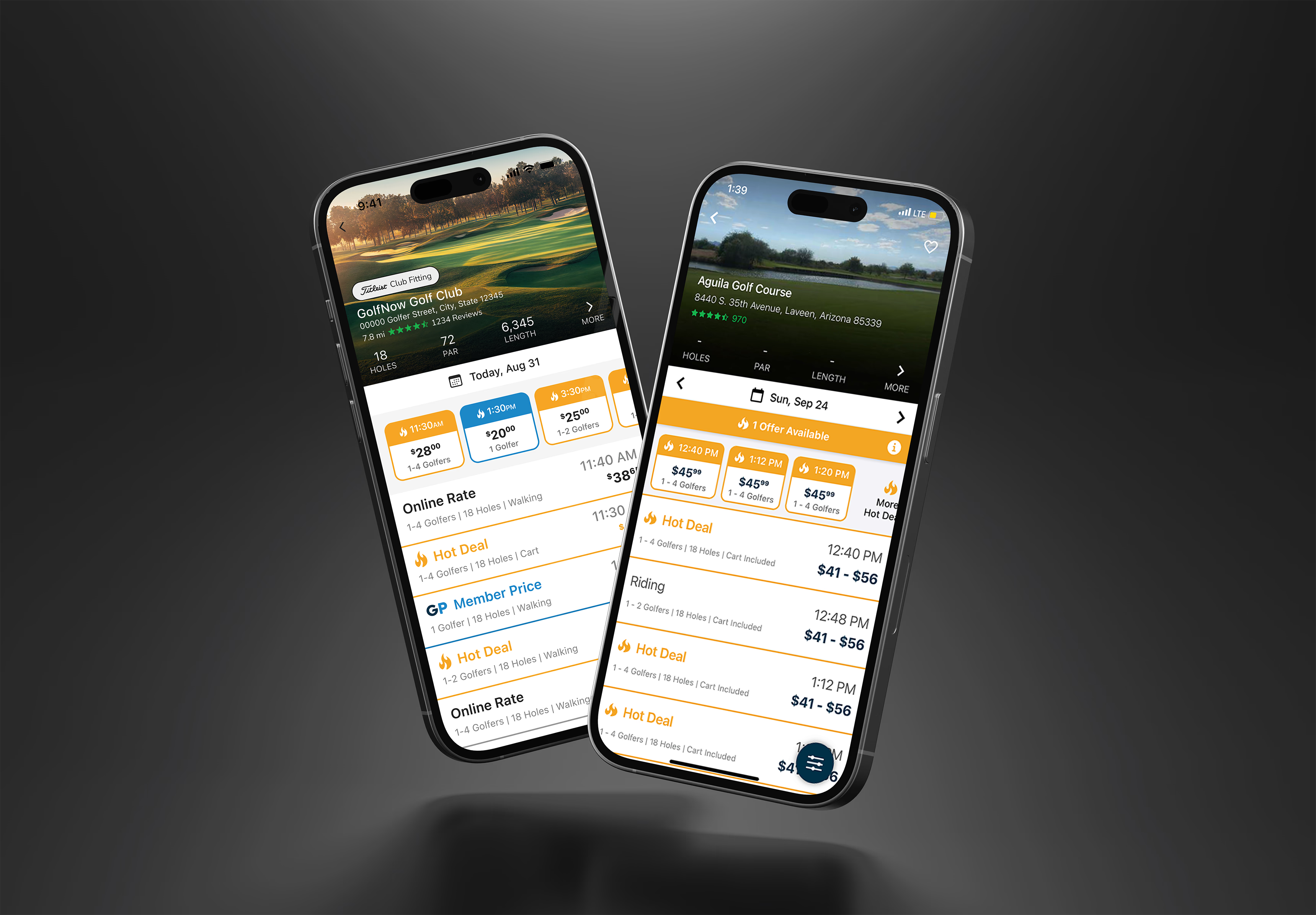
Our team identified 3 primary problems with the existing GolfNow tee time tiles.
Stale
The GolfNow app hadn’t been refreshed in over five years, leading to a visually outdated experience that lacked modern usability principles.
Clutter
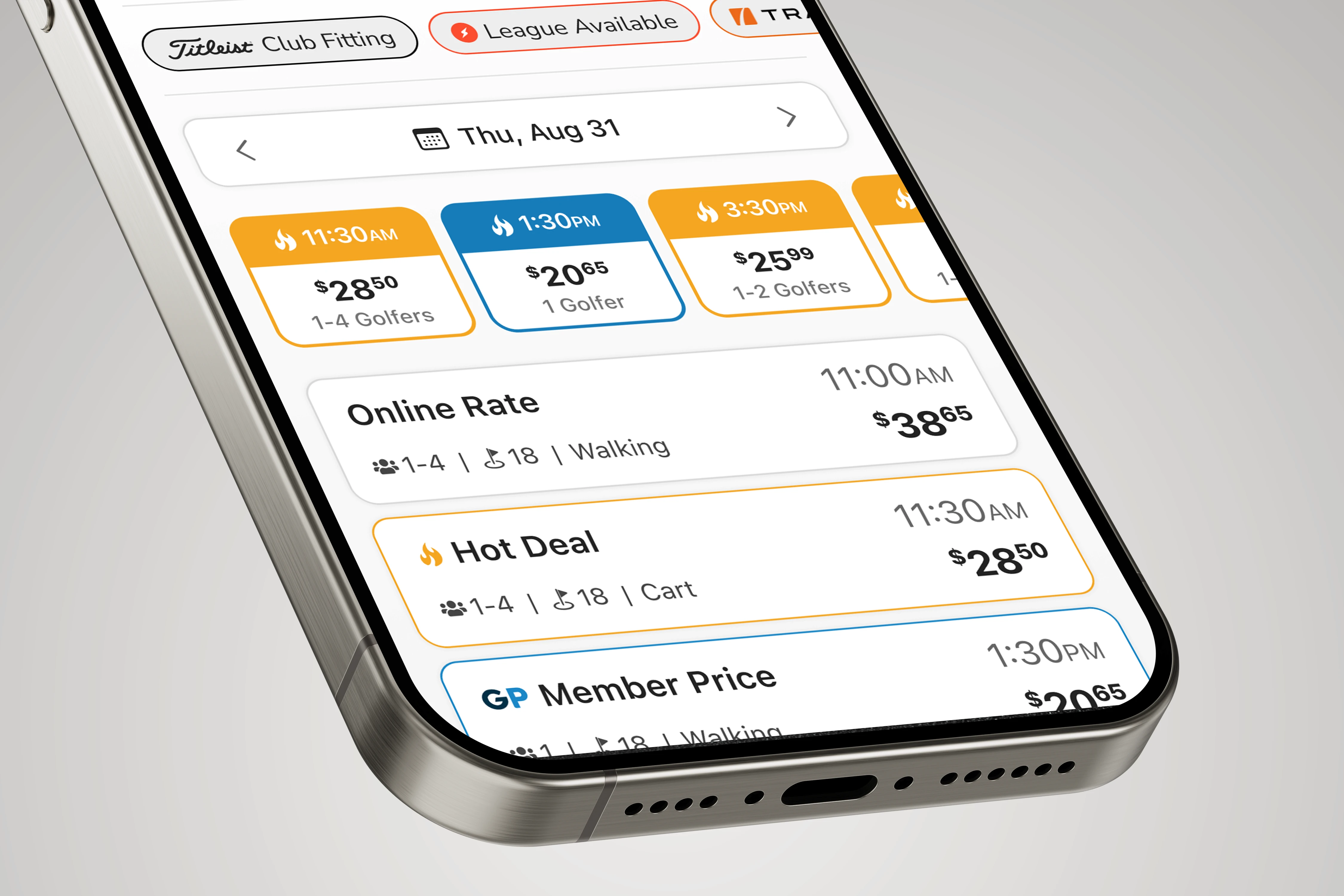
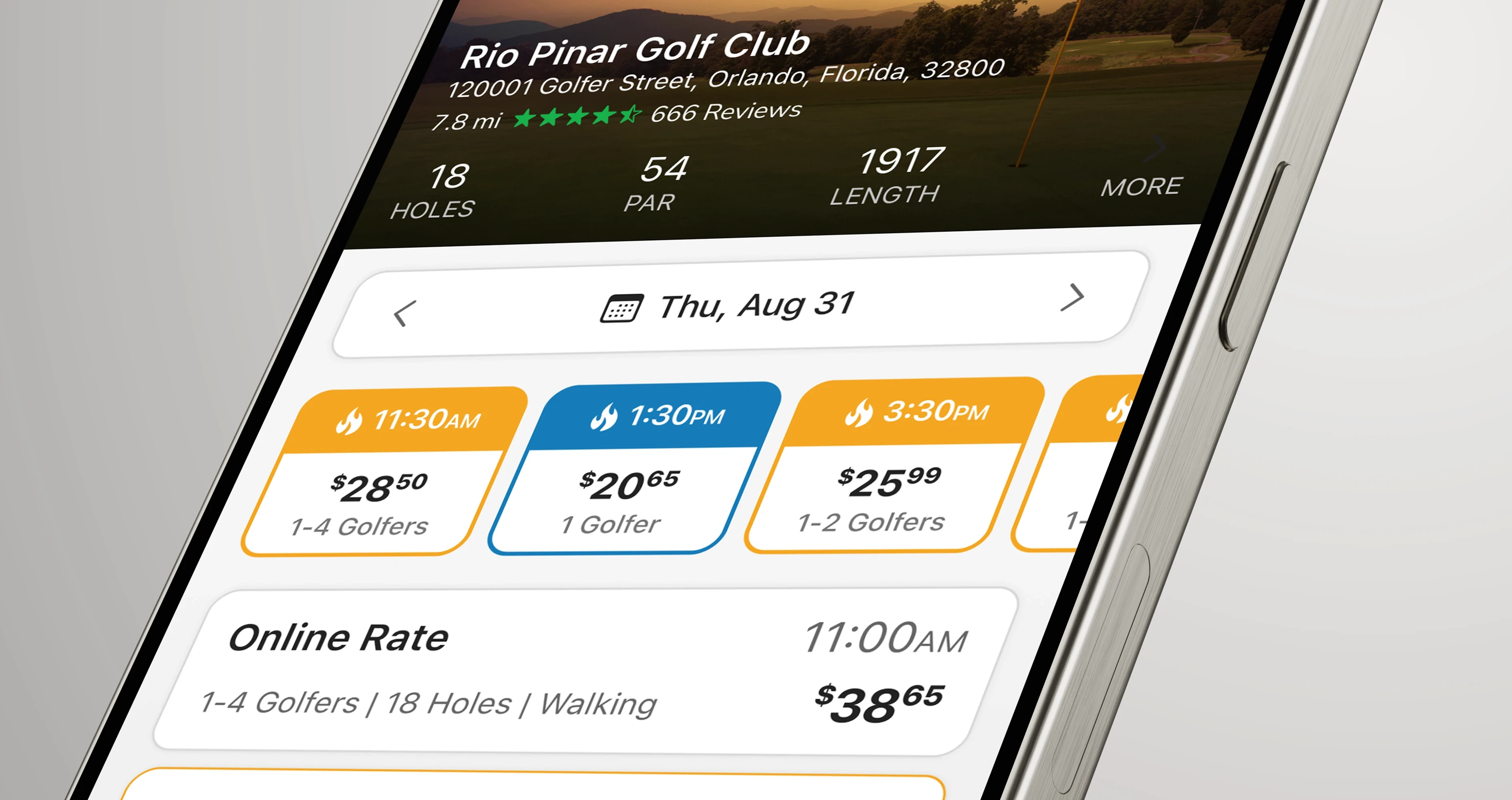
The tiles displayed a large amount of critical details (time, price, players, holes, cart/walking), making it difficult for users to scan and digest efficiently.
Risk
Any changes needed to enhance usability while ensuring no negative impact on conversion rates or revenue.
Opportunity
How can we modernize the GolfNow tee time tiles to improve clarity and user experience while maintaining strong engagement and conversion rates?
Goals
We converted our key problems into opportunities to solve for during the redesign.
Stale
Modern
Refresh the tee time tiles to align with contemporary design standards, improving visual appeal and usability.
Clutter
Simplify
Optimize the way key details are presented, making them easier to scan and interact with.
Risk
Optimize
Implement improvements that drive a better user experience without disrupting conversion rates or revenue.
Research
To ensure an informed approach, we conducted an extensive research phase, analyzing 15-20 airline apps to understand how they display time-sensitive, dynamic pricing data in a dense format. This provided insights on how to simplify our tile design while maintaining critical booking details.
Additionally, we validated our designs through a multi-phase testing strategy, including A/B testing, SUPR-Q evaluations, brand perception tasks, click tests and Net Promoter Score (NPS) analysis. This data-driven approach allowed us to measure usability, accessibility, and brand perception to refine the designs effectively.

Design Iterations
Through 15 iterations, we continuously refined the tee time tiles to enhance readability, reduce visual clutter, and maintain a clean hierarchy of information. A key focus was on balancing promotional rates with user experience, ensuring clear but non-disruptive deal visibility. We also tested the effectiveness of icons versus written details to optimize clarity and accessibility.


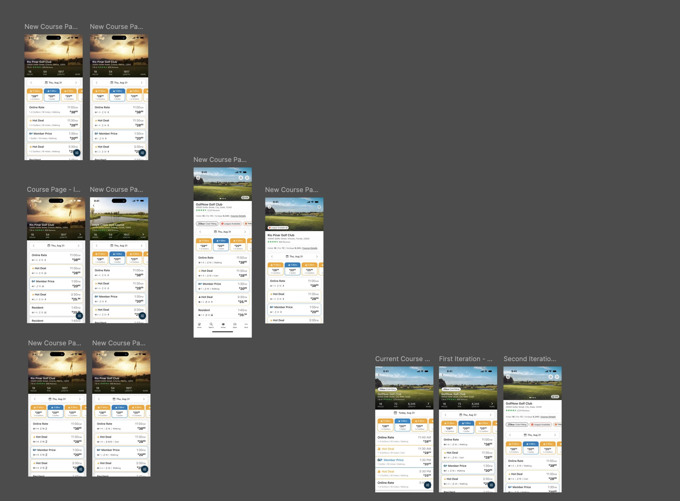
"Final" Iterations
While this project was primarily conceptual, the final iteration of our design direction successfully balanced aesthetics with functionality. A hybrid approach—using icons for quick-recognition elements like golfer count and holes, with text labels for critical details like "walking" and "cart"—proved to be the most effective. These insights will guide further refinements before implementation.


Results
While this project was primarily conceptual, these results will continue to guide our future design decisions.
Improved User Perceptions
SUPR-Q scores showed an increase in attractiveness and clean/simple presentation, validating the effectiveness of the new design. For a total of 4% overall increase in SUPR-Q scores.
4.27
Attractiveness SUPR-Q before
4.47
Attractiveness SUPR-Q after
4.27
Clean/Simple SUPR-Q before
4.57
Clean/Simple SUPR-Q after

Enhanced Brand Perception
Users rated the new design as more modern and accessible, reinforcing the impact of the refresh.
60%
Modern score before
73%
Modern score before
27%
Accessible score before
50%
Accessible score after

Optimized Information Clarity
click test comparing icons vs. text revealed that icons improved quick-glance decision-making, particularly for selecting tee times with a cart and Hot Deals.
71%
Cart Text
vs.
72%
Cart Icon
76%
Hot Deals Text
vs.
80%
Hot Deals Icon
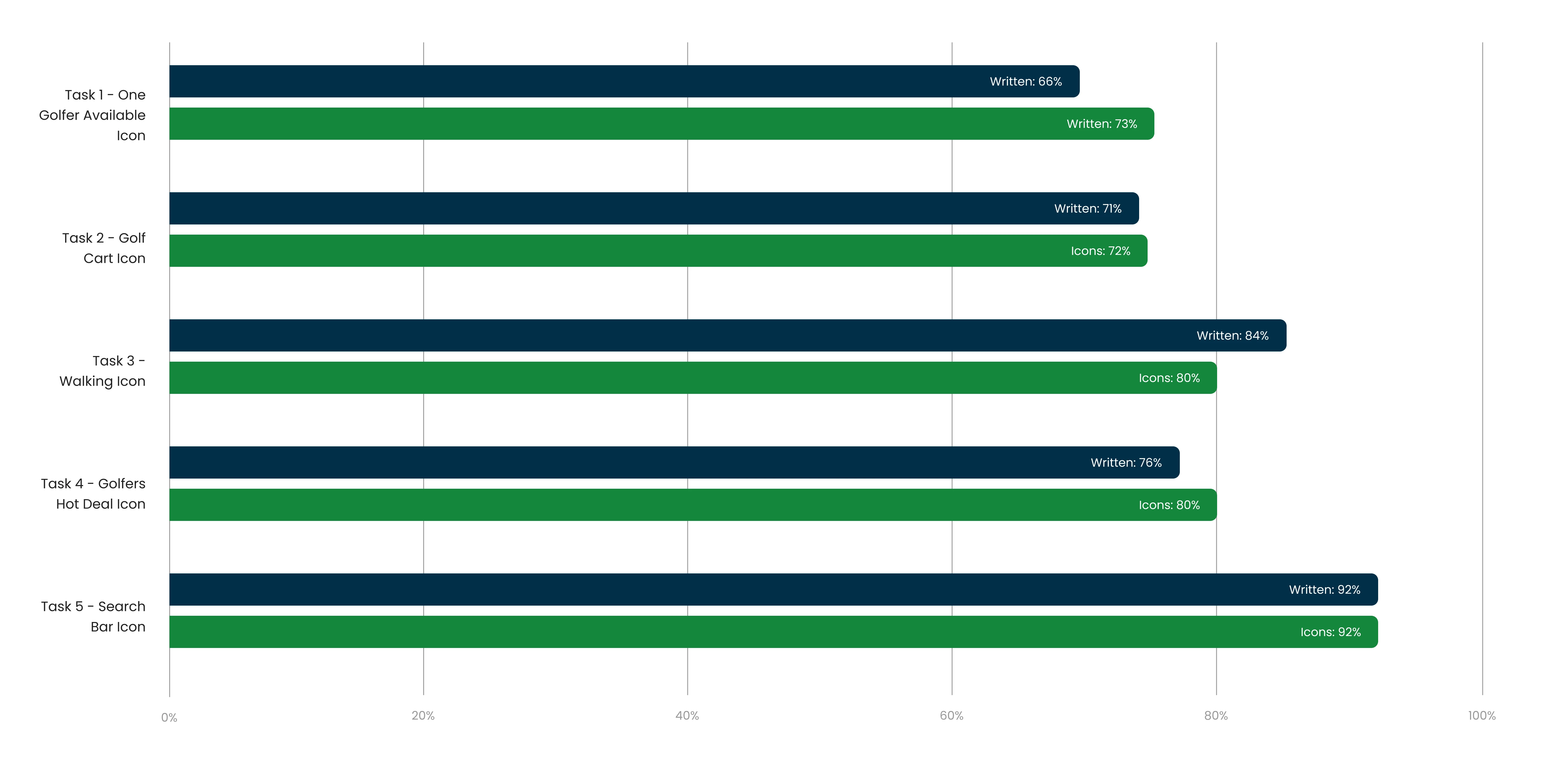
Written Design

Icon Design
By leveraging research-driven insights and continuous testing, we refined our approach to modernizing GolfNow’s tee time tiles, ensuring a streamlined and engaging user experience without sacrificing conversion performance. Future iterations will incorporate hybrid solutions to balance accessibility, usability, and business needs.